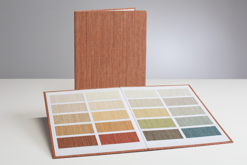
When the time comes to make that all-important presentation, it becomes glaringly obvious that there’s a huge divide between knowing what you want to say and knowing how to say it. Boards enable those making presentations to add a physical point of reference for the intended audience to get a much better idea of the subject matter in general. As such, to use a presentation board in an inappropriate or inefficient manner is to take away from the impact of the presentation and its content as a whole.
No pressure there, then!
The good news however is that regardless of what the presentation concerns, there are certain universal rules of thumb that can help set you off in the right direction.
1 – Keep Backgrounds Plain
First and foremost, while it’s important to make things look as presentable and attractive as possible, it’s also crucial to make sure that your work/content is the star of the show. This can only be done by keeping backgrounds as plain as possible as the more attention the background gets, the less attention the content gets. This isn’t to say that colours cannot be used effectively, but should at the same time be kept reasonably toned-down to make sure they don’t clash with the content
2 – Minimise Font Varieties
Another common mistake is to use all manner of different font shapes and types for no reason other than there are so many out there to choose from. More often than not however, this turns out to be a very bad idea as it is again nothing more than a means by which to distract audience members from the content and divert attention to purely aesthetic attributes. More often than not, the most effective approach of all is to use just one, single font for the whole presentation that’s easy to read from all angles and distances.
3 – Remember the Rule of Hierarchy
There will inherently be some things that take precedence over others in terms of importance in the presentation. There are many ways of communicating this, but the most obvious and effective is that of using a font size hierarchy to make certain points stand out. However, caution must be exercised as the more sizes you use and the more often you vary the font sizes, the more confusing the whole thing becomes. As a rule of thumb, try and stick with a total of three sizes for important headlines, items that need to be stressed and then the rest of the content in general.
4 – Keep Written Content Concise
Written content has the potential to be the most or the least effective of all presented to any audience on any subject. The reason being that when you try and cram too much written content into any given board, poster or display panel, you end up with something very few people will take the time to read. As such, when using written content in a presentation the key lies in keeping things as short, punchy and concise as possible. Rather than sentences and paragraphs, focus on bullet point and headlines.
5 – Limit Colour Use
Is a presentation delivered in pure black and white generally exciting? Not necessarily, but at the same time trying to bring things to life with too many colours can make the whole thing look confused, messy and generally unprofessional. If on the other hand the presentation focuses on one single colour and then occasionally uses another on a very limited basis, the impact of the second colour is really intensified.
6 – More Sheets, Less Congestion
If there’s a lot to say, the only options are to either stretch the presentation over a tone of sheets/slides, or to cram as much as possible into each sheet. While the end-result may technically be the same – all information presented accordingly – the impact on audience members is not. When a slide or sheet contains a limited amount of information, it is immediately and instinctively interpreted as important, headline news that should be taken in and digested. By contrast, when there’s a ton of information on a single sheet it’s probable that much of it will be overlooked and the important elements may get lost among the clutter.
7 – Request Feedback
Last but not least, the very best way of creating increasingly effective presentations over time is to request honest and detailed feedback from as many audience members as possible. Be it the consumer public, a business crowd at a seminar or a classroom full of students, as soon as you find out what’s being overlooked you can make all necessary efforts to correct the problem next time around.


